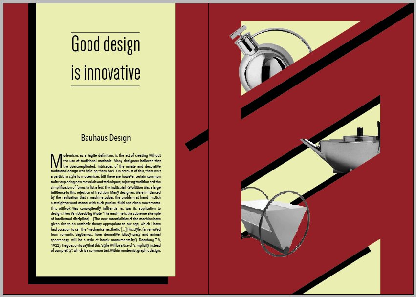
Taking inspiration from Bauhaus design which I have researched, I created a cream, black and red colour scheme which runs throughout, which by itself shows the Bauhaus theme. The amount of black used throughout is far less than the others as it seemed to darken the tone too much and give it a russian revolution theme. I looked into the askew orientation that the content is presented in the work of Joost Schmidt and Herbert Beyer. The layout is very inconsistent and very wild in this respect, but the content is kept clear by keeping the writing on the left hand page and images to the right. I Managed to source a variety of Bauahus fonts and Bauhaus styled fonts here which I have used throughout on each of the double page spread 'quote pages'. All of these design choices add up to create what I believe to be a strong theme for the book.